In previous posts on this matter, I settled on the gamma distribution as the model, as it was a continuous analogue of the poisson curve, and provided a curve that reflected actual real world scores.
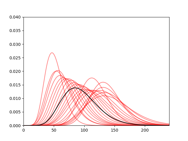
The next little challenge was to calibrate it against the “par” scores that GRAFT generates. The par scores typically range from 50 to 120 and are a little narrower than the distribution of actual scores. There were a few more quirks that came in when I was trying to make it all fit. Basically I took 6-point wide slices of each prediction set, and set them against the actual scores against which I would try and fit the gamma curve. Fortunately, at least for the 60 – 120 par range there was a reasonably consistent look to the curves, as I will show. I confined the set of historical scores to start from 1987 to 2017.

(The black curve is the fit against all scores)
A little bit haywire at the extremities, but not too bad for the main spread. I looked at the factors for the distribution, particularly the shape parameter a, to come up with something plausible.
After a bit of eyeballing a sensible function for a, I’ve set the magic function with 7.5 as the scale
def curve(rating):
    a = rating * .1 + 3
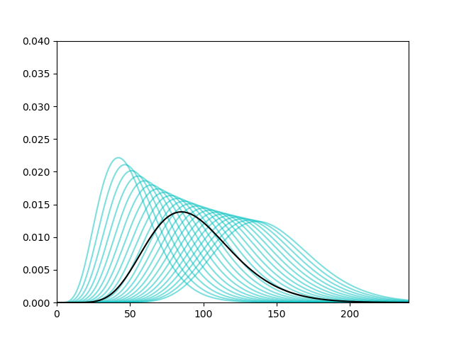
    return scipy.stats.gamma(a, 0, 7.5)
(This is Python code of course, you’ll want the scipy library to play with this. I presume, if you use R you’ll be able to figure out how to implement this.)
So in the end we have this bad boy:

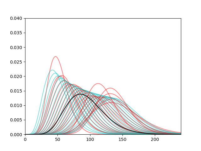
And overlaid on the actual result fits…

So that’s not too bad a fit, at least for our purposes.
A few quirks, though; the mean and median of each curve is actually regressed towards the global mean compared with the GRAFT par that was spat out. I have a feeling that this is counteracted by the spread of scores at each GRAFT tick, where a lot of scores come in slightly under average, but this is balanced by the long tail when teams go on the march and score 20 goals or more.
Well, let’s just that I haven’t put too much rigour into it before this season. There’s still a few things to mess around with, like for instance I basically set up curves for each team’s rating against each other completely independently, so there isn’t any covariance taken into account at this stage. What happens when two defense-orientated teams face off, versus two attacking teams? Well, that’s already kind of accounted for at the par setting stage (team.attack – opposition.defense + league_par).
I’ve gotten as far as cooking up some rough examples for the opener on Thursday night:
From the main site, Richmond’s par is 90.8, Carlton’s par is 58.8.
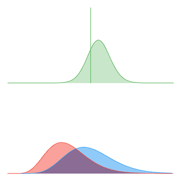
Based on all of the above, Richmond’s likelihood of winning is 76%, with a mean winning margin of 24. Well, that’s our first bit of weirdness there: GRAFT states that Richmond are better by 32 points, so what’s happening there?
The same sort of thing is happening with the base scores: Again, the idea of GRAFT is that each par score represents what each team should score against each other, given past performances, with the weekly adjustments carried out by a factor, calibrated to maximise the amount of correct tips. It’s a little fuzzier on margins even though margins are at the core of the result.
Richmond’s par (rounded off) is 90.8, but the mean of their curve is 90.6 (OK, not too crazy) and the median is 88.1.
As for Carlton, with a par of 58.8, their mean is 66.6 and their median is 64.1.
We’re fine with the median being a little skewiff, it’s not a symmetrical distribution, and the elongated tail is consistent with real scores. (That’s why I picked the gamma distribution, after all, as it was such a good fit for the historical record)

So obviously there’s regression to the global mean happening each week. Thing is, the weekly ratings are updated according to weekly results based on the actual scores, based on factors which boil down to *Hulk voice* “big better than small”. While I’ve tweaked how the ratings are presented this year (dropping them by a factor of 10 and making them floating numbers) that part has essentially not changed.
What I was dissatisfied with was how the probabilities of individual games and the season as a whole were calculated. That practice of using a normal distribution which would not tail off nicely at zero so these required a horrible fudge of jacking up both teams’ scores. I am glad to be done with that nonsense.
With this new algorithm, I am at the point where I am happy to publish the probabilities, intending to roll them out by Wednesday (boy this blog entry is going to become dated fast), but at the same time they probably need a little more rigour applied, so caution is advised if you’re going to take heed of them for certain activities. Entertainment purposes only!
Another thing that will happen on the site is that I will be producing CSV files for the tips (with lines and likelihoods) and ratings for people to scrape if they like – a little more detail on the the formats and such in the next post.